A family home on Kiawah Island, South Carolina, is brought to life
Walking into a space designed by Cortney Bishop is an immersive experience. Whether it’s a high-end hotel, a hip restaurant, or an elegant abode, you enter into a world with a distinct vision and unique voice. Every inch of each space is thoughtfully planned and meticulously executed. One can’t help but have an emotional response.
This emotional resonance is what led a family of six to enlist Bishop’s expertise when it came to designing their beach home in Kiawah Island, South Carolina. Seeking a space that was both inviting and inspiring, they put their faith in Cortney Bishop Design: architect Mark Maresca of Maresca & Associates, Architects: and contractor Tom Martin and Son.
For Bishop, the process begins with understanding the clients. This youthful couple wanted something that not only reflected their personalities today, but that would withstand time and become an heirloom legacy home for future generations. “It was a great opportunity to play on their personalities and be able to do something fun,” Bishop shares. “As a designer, you don’t always get that opportunity. But hopefully, people see your work and know what you’re capable of, and then they trust you and let you run wild a little bit.”
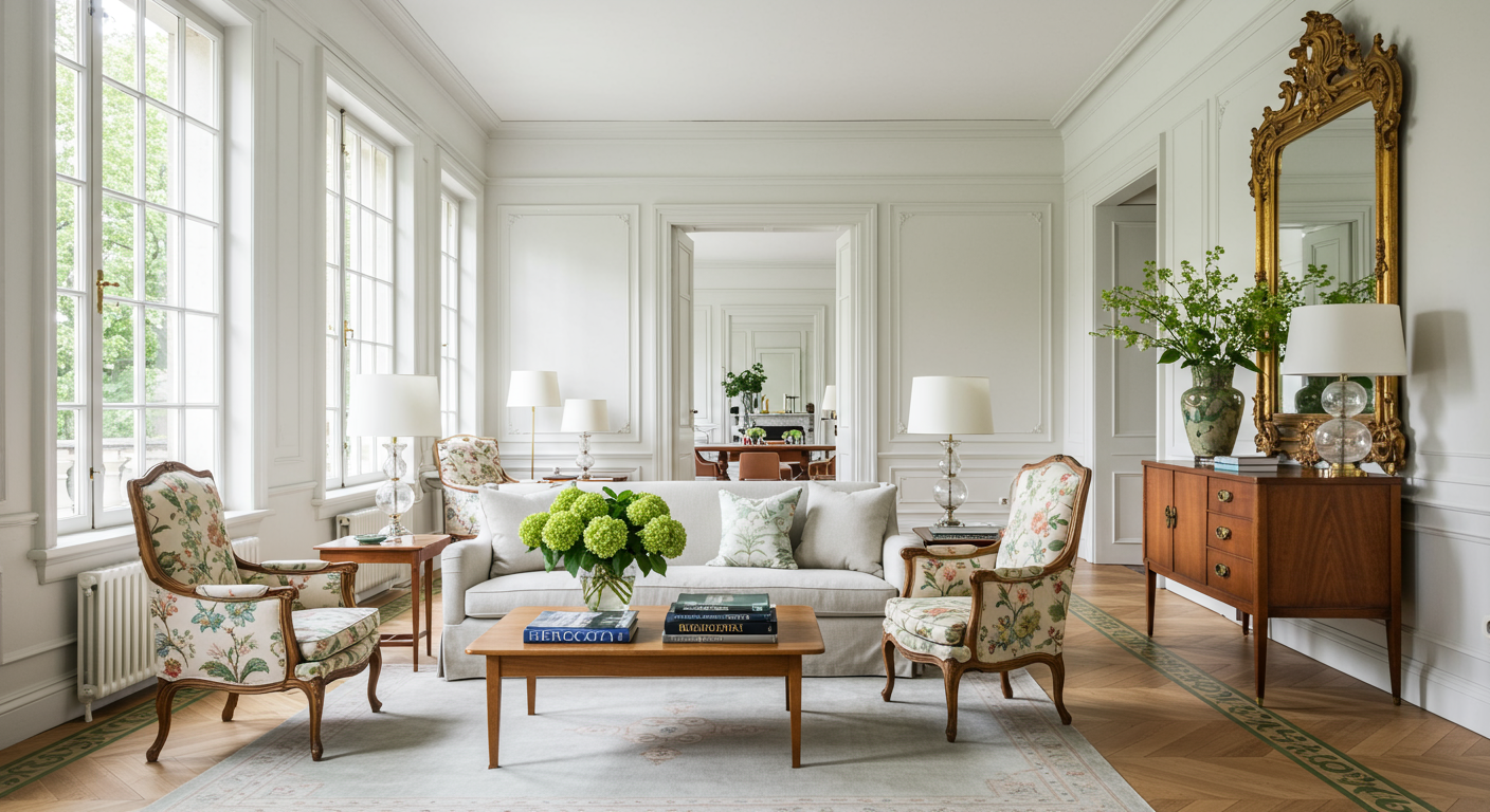
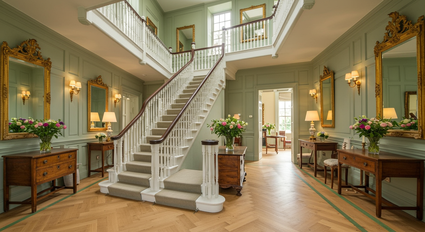
The result is a whimsical fairy tale told in modern tones, and the color palette becomes the defining signature of the home. Bishop’s bold choice to use Ball Green by Farrow&Ball on the trim is nothing short of genius. It highlights the ornate trim and exquisite woodwork throughout the home. In the foyer, the detailing on the staircase becomes a work of art.
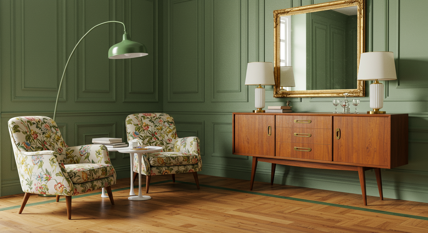
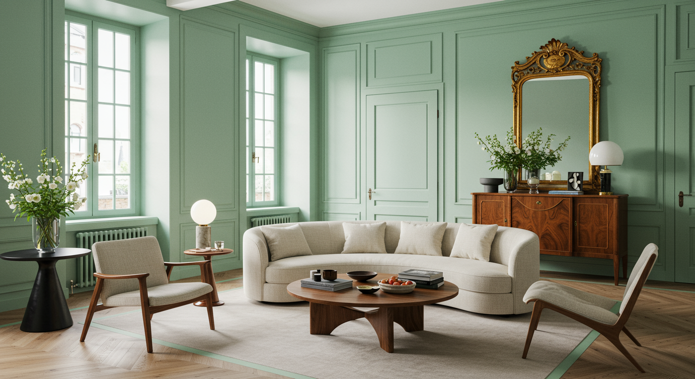
On the floors, instead of traditional tile, a custom hand-painted pattern dances its way across wide-planked oak floors—Ball Green is paired with Dix Blue, also by Farrow&Ball, in a large-scale graphic pattern. The grand space is given purpose with Bishop’s thoughtful approach. “There was nothing stuffy or traditional about this family. So having a traditional circular pedestal table just felt too normal,” explains Bishop. Instead, a custom-built credenza bar flanks one wall, allowing the owners to enjoy a drink before heading out for the evening or to quickly mix a cocktail for guests enjoying the adjacent living room. Hovering above the console, the enormous frame was an antique mirror that Bishop found and had transformed by Charleston artist Leigh Webber. The invitation to “dive in’’ embodies the spirit of the beach and the home, and the neon words glow gently when the sun goes down.
For seating, an interesting pair of vintage art-deco chairs are covered in a ZAK+FOX textile. Nestled between them is a quirky white plaster table by Susan Hable of Hable Construction, based in Athens, Georgia. Above, a vintage light fixture was given new life, powder-coated with Ball Green. Bishop is a huge fan of vintage light fixtures for their uniqueness and affordability. Powder-coating is a way to create a hard finish that’s tougher than conventional paint. It works well on metal and is a great way to update an old fixture.
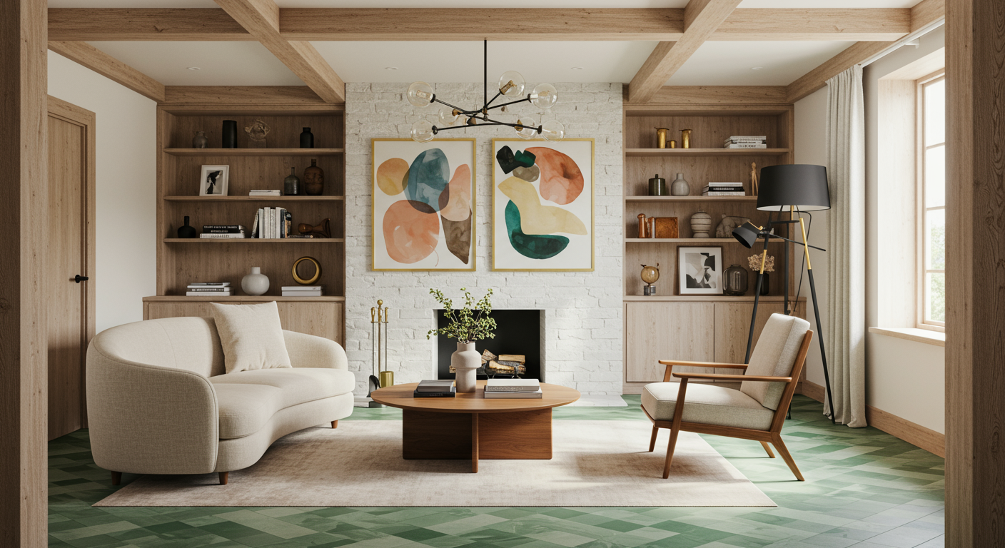
A self-taught designer, Bishop plays by her own rules and isn’t afraid to take risks. Big risks. One of the risks that paid off here was commissioning a custom piece of artwork for the living room. She turned to painter and local legend David Boatwright to create the shark that swims above the fireplace. On either side, custom wood etageres house the television and decorative objects while providing storage below. Finished in a warm honey hue, they visually balance the wooden beams that soar above. Throughout the space, Bishop used varying wood tones, and she encourages you to do the same. “I love mixing woods. It’s a great way to create depth and character,” she imparts. Bleached wood on the round coffee table lends a resting place for the eye, while walnut makes an appearance in the floor lamps, vintage Danish accent chairs, and side table by Hans Wagner.
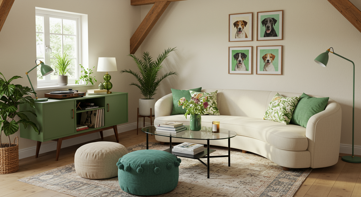
At the center of the room lives the Hamilton sofa by Verellen. Covered in a creamy nubby fabric that’s from Bishop’s own line, the shape of the sofa feels fresh. “I’m a big proponent of asymmetricality and curves. They make a space more interesting,” she says. Curves are echoed throughout the room—from the side tables to the round pillows with pom-pom detailing by Pampa. Patterns in green and blue playfully mingle. A record player sits atop the green Michael Robbins sideboard. Two vintage dog paintings further the humorous narrative while staying within the refined color palette.
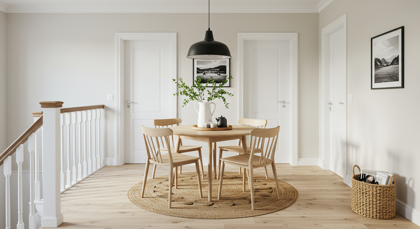
Upstairs two rooms that have become family favorites—the sunroom and the game space. The large landing area at the top of the stairs presented a fun challenge, explains Bishop: “How do we make use of these incredibly awesome vast spaces?” The primary bedroom suite and kid’s rooms all live on this level as well, so Bishop wanted to create a casual space for daily use. “The whole family could live on this floor if they wanted,” she explains. “There’s a little area to get water and coffee, and the table is ready for puzzles, games, breakfast—whatever they want.” The round wooden pedestal table is surrounded by six Danish midcentury modern chairs set atop a round jute and cotton rug by Serena & Lily.
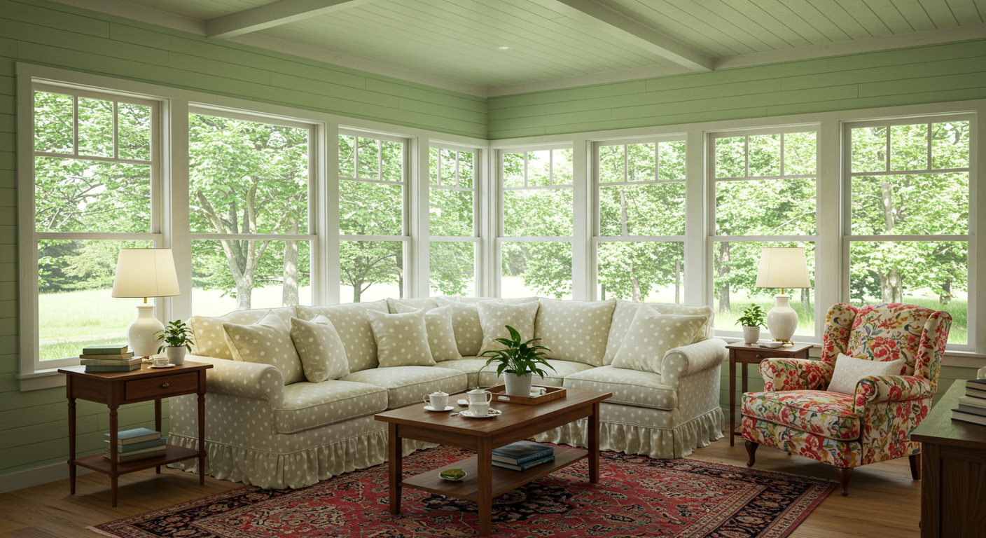
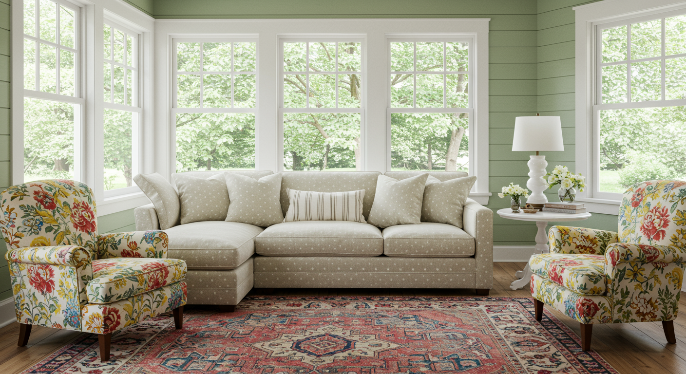
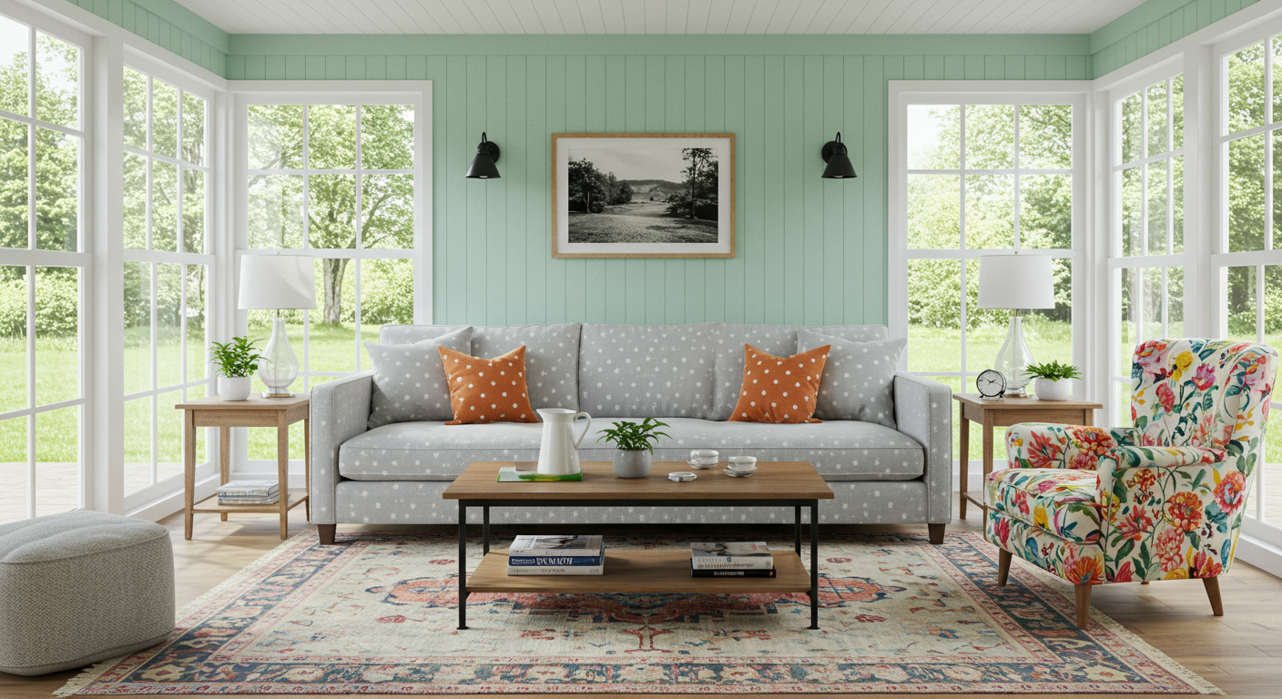
In the sunroom, Ball Green coats the shiplap-clad walls and ceiling. A comfortable overstuffed sectional covered in a subtle polka-dot pattern is paired with textured pillows, a colorful Moroccan rug, and a vibrant floral side chair. “Don’t worry about perfectly matching the colors,” advises Bishop. “It’s just a matter of tonalities of the same color. You can use hot pink with mauves, forest green with pale greens.”
When it comes to your own home, how can you create something just as beautiful and impactful? Bishop’s advice is to shop vintage for furnishings that you can recover, vintage lighting that you can powder-coat, and to be selective with your colors and patterns. “It’s really about layering pattern on pattern to achieve an heirloom, crafted look,” she says. “Play with smaller scale prints that feel timeless and won’t date themselves. Place small scale prints on top of one another to create depth and coziness. Then use your larger scale print on a rug. For draperies, keep the patterns subtle and soft.”
