A RENTAL PROPERTY IN MOUNT PLEASANT, SOUTH CAROLINA, GETS AN UNDERSTATED UPGRADE.
Waves crashing and sand between your toes may not be what your mind immediately conjures when you think of winter…but a seaside escape can be unexpectedly cozy if done the right way.
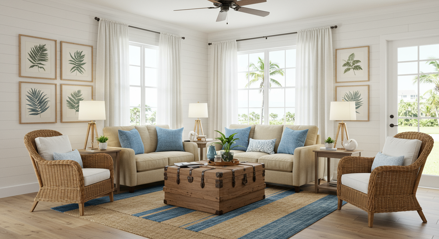
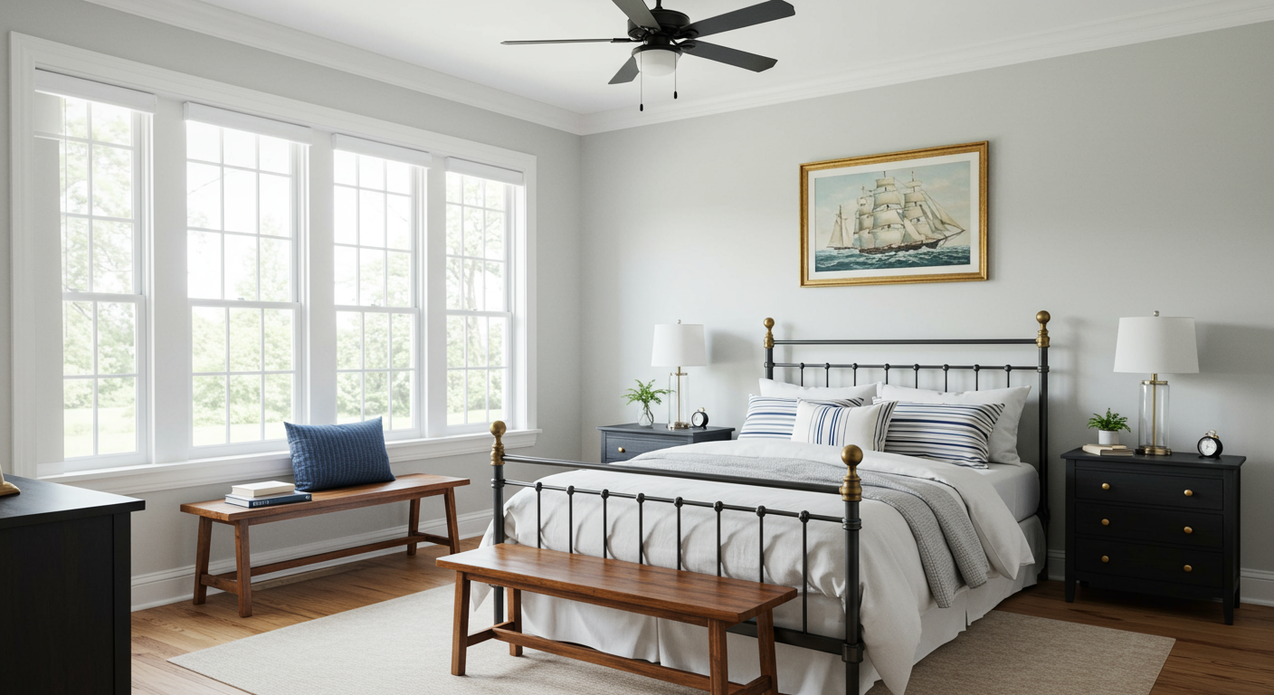
When the new owners of this three-bedroom rental property in Mount Pleasant, South Carolina, purchased the home, they took an overall look at the space and knew that it needed to be warmed up. With a few simple but effective changes, they were able to add personality, depth, texture, and warmth to this beautiful Lowcountry getaway.
Before:
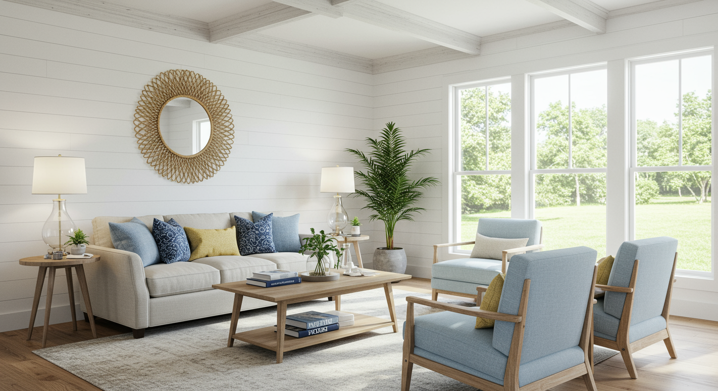
After:
TEXTURE
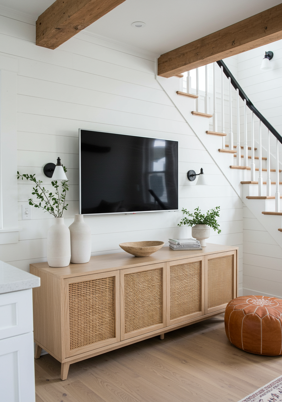
To add architectural interest, the owners began by adding texture to the walls. In the living room, they added a four-inch-thick vertical shiplap to the walls, which not only adds depth and intrigue but actually makes the overall room appear longer.
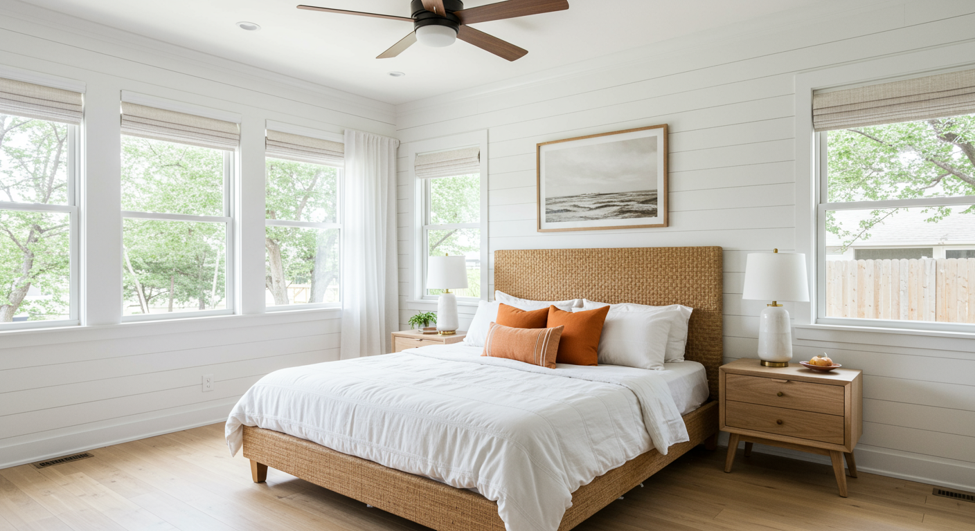
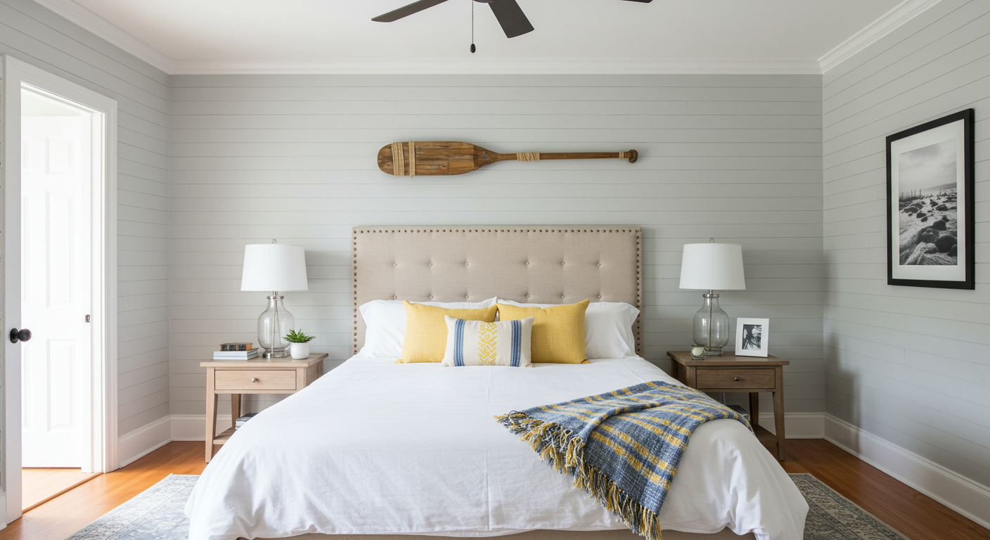
In one bedroom, a vertical shiplap was added to the headboard focal wall. In a second bedroom, a board and batten treatment was added to the lower three-quarters of the walls.
Before:
After:
Both shiplap and board and batten are techniques that are fairly straightforward and easy to implement in your own home.
Beadboard is another simple yet effective material that can be added either vertically or horizontally, depending on the overall style you’d like to achieve.
NATURAL ELEMENTS
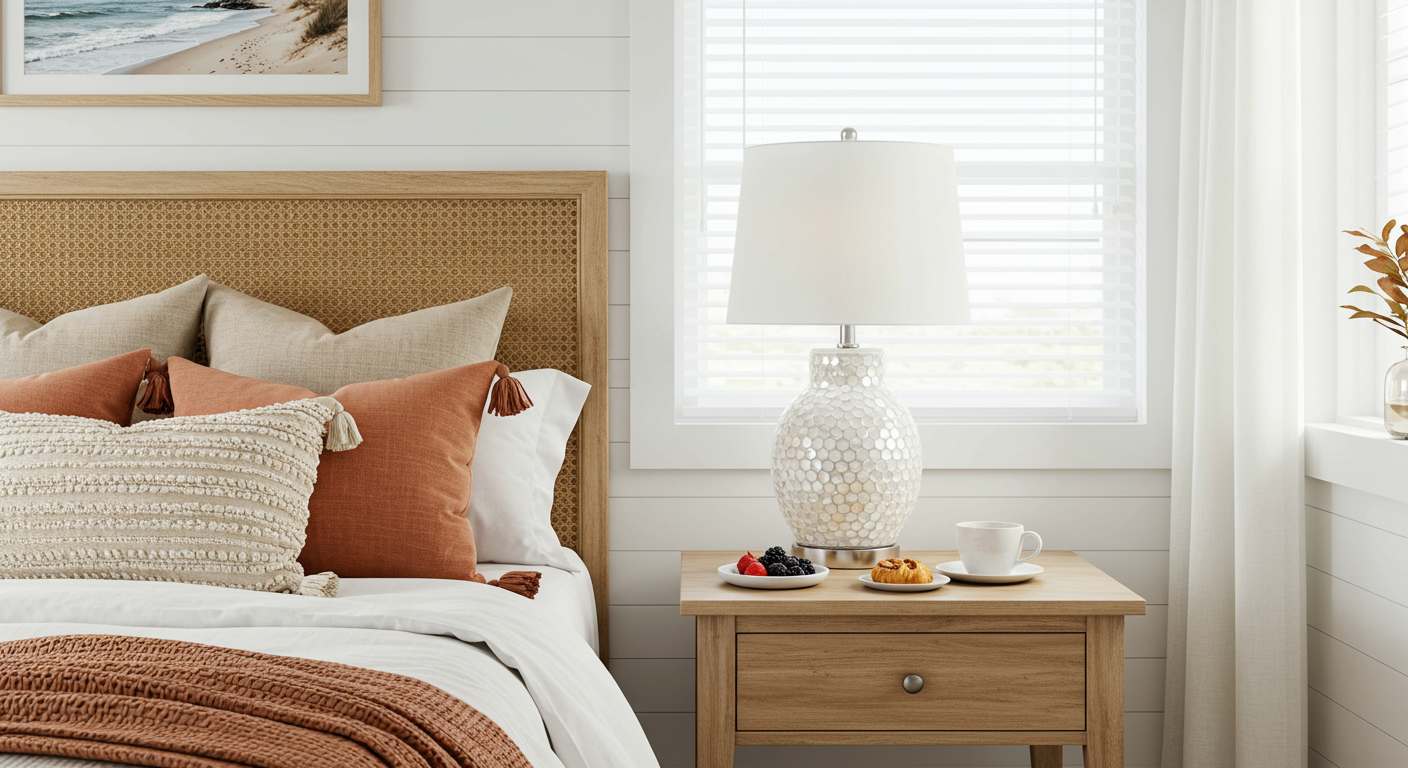
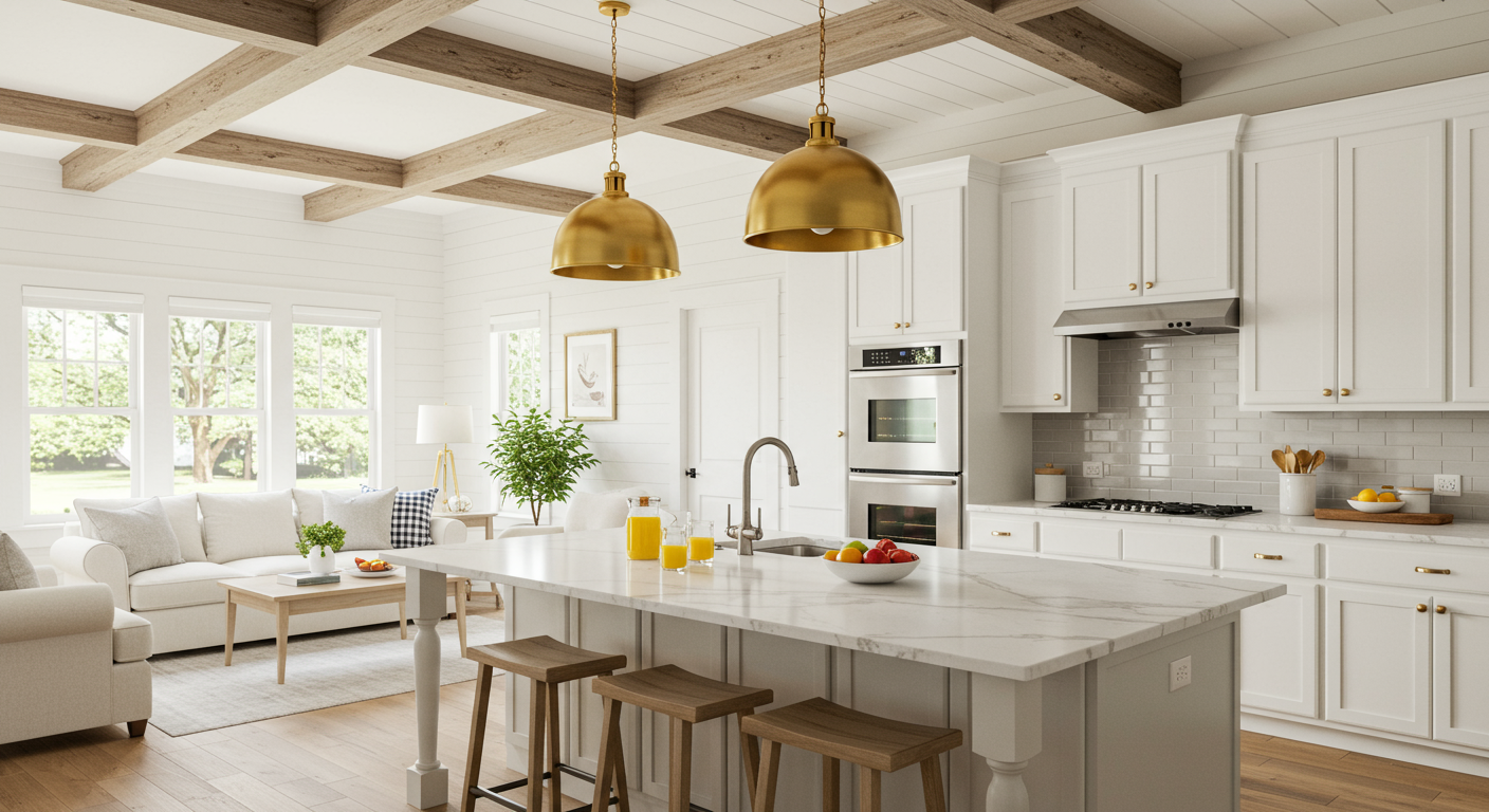
Bringing natural elements and materials into your space can help connect you to your surroundings, resulting in a grounding and calming effect. In the family room and kitchen, large reclaimed wood beams were added to the ceiling. The impact is palpable. They not only draw the eye upward, but they also add a bit of history and soul to the home. Carpeting was removed in favor of hardwood floors. Driftwood tables, a large seagrass mirror, a capiz shell side table, and lamp base, a wicker headboard, and other materials that could be found locally in nature can be discovered peppered throughout the home.
MIXED METALS
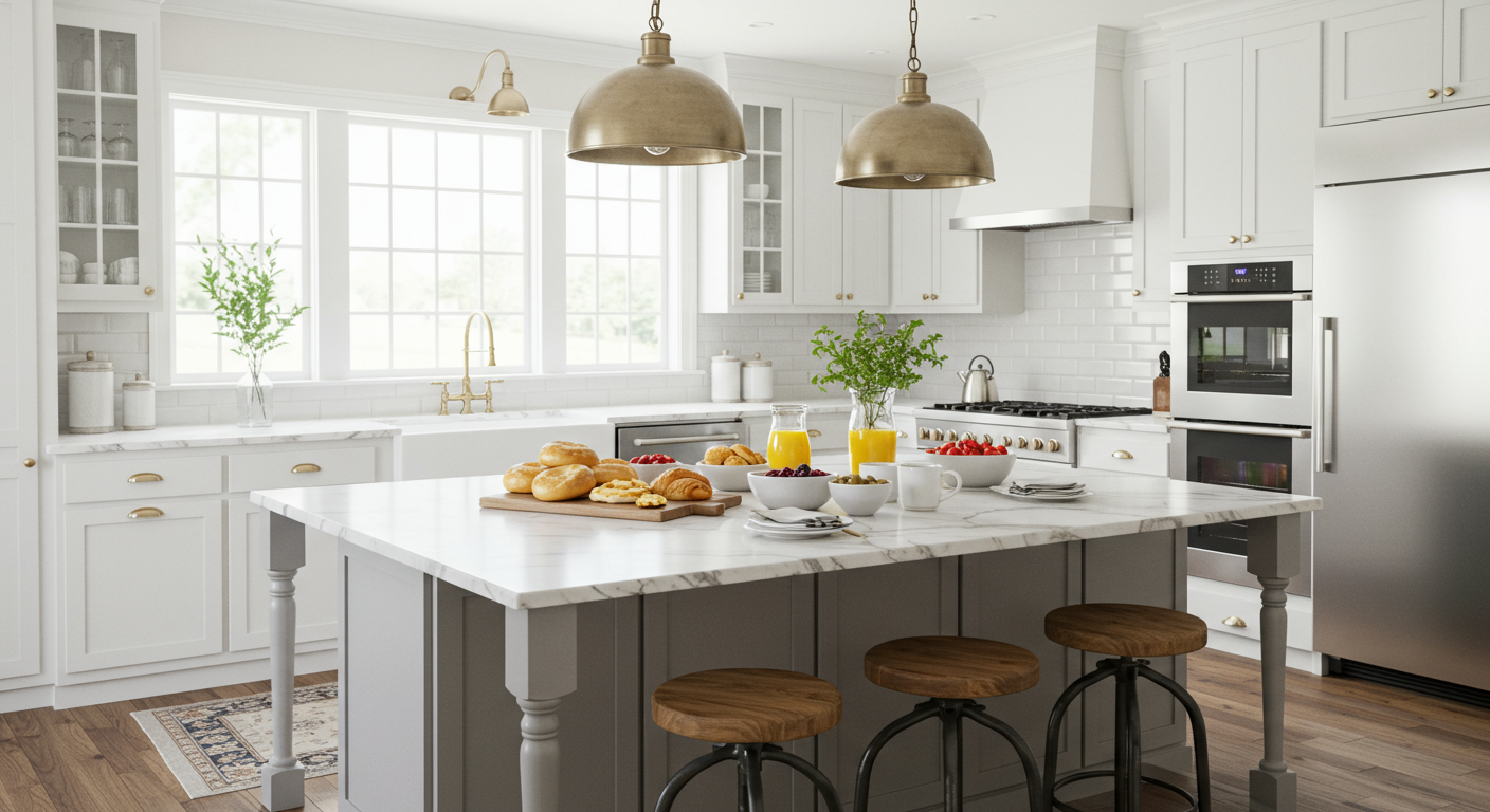
Forgo the matchy-matchy rules when it comes to metals, and feel free to mix them up. A strict palette of silver (stainless steel appliances and brushed nickel hardware) can wind up feeling cold and sterile. Adding the oversized hammered metal light fixture in a gold-hued tone instantly cozies up the kitchen.
The Trinsic kitchen faucet in champagne bronze by Delta is a designer favorite (it’s been spotted in this very magazine numerous times!) and adds a needed note of gold to balance the light fixture.
In your home, if you’re swimming in a sea of silver, go for the gold. Bring in elements of yellow gold, rose gold, or bronze to instantly add visual warmth.
To learn more visit @sullivansnest, or to book your own seaside escape, visit sullivansnest.com.
We shared this Before + After article with you in the fall/winter 2021 issue of NEST Magazine. To view the full issue, click here.
